
Email Design Best Practices: Create Emails That Actually Get Clicked
Subscribers glance, they don't read. The email layout that survives two seconds: single column, one job per block, one thumb-sized CTA — plus dark mode traps and a 30-second pre-send test.
Your subscribers don't read emails — they glance at them. Between the inbox list, the preview pane and the delete button, a marketing email gets about two seconds to prove it's worth more. Email design is the craft of surviving that glance: making the message and the action obvious before anyone decides to actually read.
This guide covers the email layout that works (and why), the design choices that decide clicks — hierarchy, CTA, typography, images — plus mobile and dark mode realities, and how to test an email before you hit send.
Start With the Layout: One Column, One Job Per Block
The most reliable email layout hasn't changed in a decade, because inboxes haven't: a single column, 600px wide, read top to bottom. Multi-column desktop-style layouts break unpredictably across email clients and collapse badly on phones — where most of your opens happen.
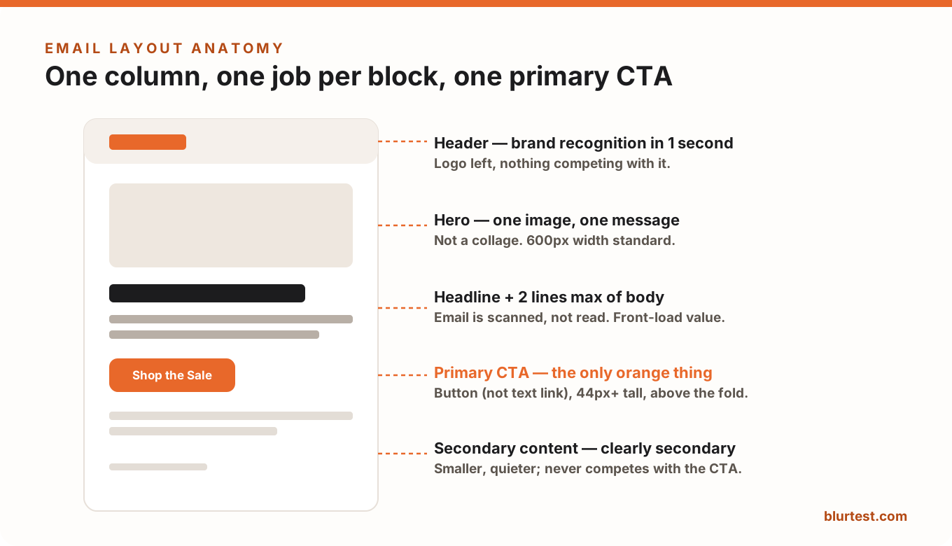
Each block has one job: the header identifies you in a second, the hero carries one image and one message, the headline plus two lines of body deliver the value, the button asks for exactly one action. If a block can't say what its job is, it's friction — cut it.
Visual Hierarchy: The Blur Test for Emails
The same visual hierarchy rules that govern landing pages govern emails — but compressed into a 600px strip viewed for two seconds. The honest check is the blur test: blur your email and see what survives.
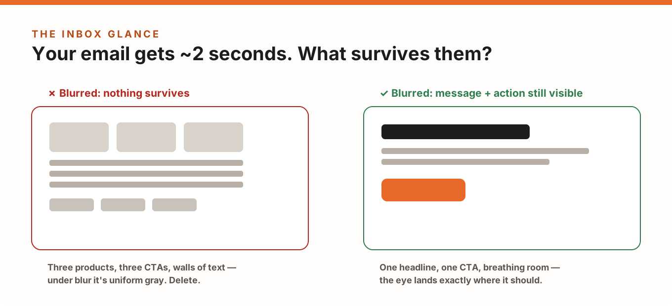
A blurred good email shows exactly two things: a dark headline block and one high-contrast button. If your blurred email is uniform gray — the classic result of three products, three buttons and dense text — the design is asking the reader to do the sorting. In an inbox, nobody sorts; they delete.
The CTA: One Button, Built for Thumbs
- One primary CTA per email. Every additional competing button splits attention and lowers total clicks. Secondary links are fine — as quiet text links, clearly subordinate.
- A real button, not a text link. Bulletproof HTML button, minimum ~44px tall, with generous padding — comfortable for a thumb on a phone.
- The only accent-colored element. Reserve your loudest color for the button. If the header, badges and prices share its color, the button stops being findable. (The same rule as CTA buttons on landing pages.)
- Above the first scroll. The primary CTA should be visible without scrolling on a phone; repeat it at the bottom for readers who do scroll.
- Outcome copy: "Get My Discount" beats "Click Here" — the button should say what happens.
Typography and Spacing That Survive the Inbox
- Minimum 16px body text (14px absolute floor for captions) — phones downscale mercilessly.
- Line height ~1.5, paragraphs 2–3 lines max. Email is skimmed; walls of text are deleted unread.
- System-safe font stacks. Custom webfonts fail in many clients; always define a fallback that keeps your hierarchy intact.
- Whitespace is structure: 24–32px between blocks tells the eye where one thought ends and the next begins — the email version of whitespace as a conversion tool.
Images: Assume They Might Not Load
Several major clients still block images by default, and slow connections skip them. Design so the email works with images off: real HTML text for the headline and CTA (never text baked into an image), meaningful alt text on every image, and a background color behind image areas so the layout doesn't collapse into white voids. One strong hero image beats a collage — in file size, in clarity, and under blur.
Mobile and Dark Mode: Where Emails Actually Get Read
Well over half of opens happen on phones, and a growing share in dark mode. The checklist:
- Single column at 100% width with 16–24px side padding; no horizontal scrolling, ever.
- Tap targets (buttons, links) at least 44px, with space between adjacent links.
- Test in dark mode: pure-black text on transparent backgrounds inverts badly, and dark logos disappear on dark backgrounds — use padding-backed light backgrounds or dark-mode-safe transparent PNGs.
- Subject + preheader are part of the design: they're the copy the inbox list shows, so write them together (and stop the preheader from pulling in "View in browser").
Common Email Design Mistakes
- Too many CTAs — the #1 click killer; every extra button dilutes the main ask.
- Walls of text — if the value isn't visible in a glance, it isn't visible.
- All-image emails — one blocked download and your email is a blank rectangle (with a spam-filter penalty on top).
- Ignoring dark mode — a growing slice of your list sees an unreadable inverted mess.
- Forgetting the footer — unsubscribe and address aren't just legal (CAN-SPAM/GDPR); a clean footer is a trust signal.
Test Before You Send: The 30-Second Check
Every email is a one-shot send — there's no iterating after it lands. Before you hit send, run the design through a blur check: BlurTest's email analysis takes a screenshot of your email, blurs it, and scores whether your message and CTA survive the inbox glance — with a heatmap showing where attention actually lands and what to fix if it doesn't. Thirty seconds, before the send button, while you can still change things.
Email Design FAQ
What's the ideal email width?
600px is the reliable standard — wide enough for comfortable desktop reading, and it scales cleanly down to phone widths in a single column.
How many CTAs should an email have?
One primary action, styled as a button and repeated at the bottom if the email is long. Anything else should be a visibly secondary text link.
Why do my emails look different in every client?
Email HTML rendering is fragmented — each client supports a different subset of CSS. Single-column table-based layouts, system font fallbacks and real HTML text are the defenses; test in the clients your audience actually uses.
How do I know if my email design works before sending?
Blur it. If the headline and button still dominate, the hierarchy works. BlurTest's email analysis automates exactly that check and adds a clarity score you can compare between drafts.
Test your email design before you hit send
Crowded inboxes give you one glance. See whether your key message and CTA survive it — analyzed in 30 seconds.
Analyze My EmailOr start with a free design roast — no signup needed.