
Banner Ad Design: Principles and Examples That Beat Banner Blindness
Banners get glanced at for under a second — when they get looked at at all. The four-element anatomy (brand, one message, whitespace, button CTA), patterns worth copying, and the mistakes that silently burn display budgets.
The average display banner gets glanced at for well under a second — when it gets looked at at all. Banner blindness is real, measurable, and the default outcome. Good banner ad design isn't about being beautiful; it's about communicating a complete thought (brand → benefit → action) inside a glance that the viewer didn't plan to give you.
Here's the anatomy that works, the principles behind it, and the failure patterns that quietly burn display budgets.
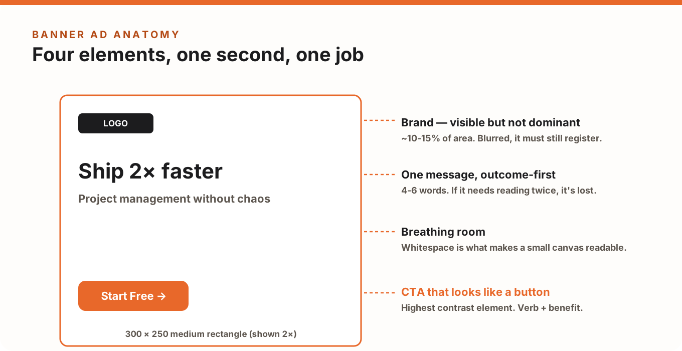
The Four-Element Anatomy
- Brand (10–15% of the area). Visible enough to register even without a click — view-through recognition is half of what display buys you — but never the dominant element. If your logo is the biggest thing in the banner, the ad is about you, not the viewer.
- One message, outcome-first. Four to six words that state a benefit ("Ship 2× faster"), not a category ("Project management software"). One message means one: every extra claim halves the odds any claim lands.
- Whitespace. The counterintuitive one. Small canvases tempt you to fill every pixel; the banners that read at a glance are the ones with room around the message. Density reads as noise, and noise gets blanked out.
- A CTA that looks like a button. Highest-contrast element in the frame, verb plus benefit ("Start Free", "Get the Guide"), big enough to read at actual size. Text-only CTAs disappear.
The Hierarchy Test for Banners
Because the viewing time is so short, banners live or die on visual hierarchy more than any other format. The reading order must be automatic: message → CTA → brand (or brand first for pure awareness). Run the blur test on your creative: blurred, you should still identify something bold (the message), a button shape (the CTA), and a brand mark. If the blur shows uniform texture, the design is decoration, not communication — BlurTest's banner analysis scores this in 30 seconds, per size.
Design Principles That Survive Small Sizes
- Design for the smallest size first. A concept that works at 300×250 scales up gracefully; a 970px masterpiece rarely scales down. (Size-by-size guidance: standard banner sizes guide.)
- Re-compose per ratio, don't scale. A leaderboard (728×90) is a one-line layout: brand left, message center, button right. A skyscraper (160×600) is a vertical stack. Same elements, different composition.
- Type: one weight for the message, nothing under ~16px at final size. Elegant thin fonts die in display.
- Contrast against typical page backgrounds: banners sit on white content pages — a white banner with a hairline border dissolves. Give the canvas its own tone.
- Photos earn their place or leave. A face looking toward your CTA helps; generic stock imagery steals contrast from the message. When in doubt, flat color + type outperforms.
- Animation: one loop, message-first. If you animate, the final resting frame must carry the complete message — many impressions only see that frame.
What Good Looks Like: Three Patterns Worth Copying
- The flat-color statement: solid brand-color canvas, one huge line, one button. Ugly-simple, reads in 0.3 seconds, consistently outperforms "designed" banners in glance tests.
- The product-in-hand: single cutout product shot on clean ground, benefit line, button. Works because the subject is one object with hard edges — it survives both blur and banner blindness.
- The before/after split: two states, one arrow, one button. The layout is the message, so it needs almost no reading.
The Five Budget-Burning Mistakes
- Three messages in one banner — offer, feature list and tagline fighting; nothing lands.
- CTA styled as text — no button shape, no click affordance, no clicks.
- Logo-dominant layouts — brand teams love them; glance tests don't.
- Filling every pixel — density kills the one thing a banner must do: read instantly.
- Same file scaled to every size — text that's readable at 336×280 becomes ant-print at 320×50.
Test Before You Spend
Display waste is silent: the campaign runs, impressions accumulate, and nobody can say whether the creative ever communicated. Before the budget goes live, run each size through BlurTest's banner analysis — it shows what a glance actually registers (message? button? brand?) and scores the creative so you can fix the weak sizes instead of averaging them into the campaign.
Banner Design FAQ
What makes a banner ad effective?
A complete thought at a glance: one outcome-focused message in large type, a button-shaped CTA with the highest contrast in the frame, a visible-but-modest brand mark, and enough whitespace that all three register in under a second.
How much text should a banner ad have?
Four to six words for the message plus two or three on the button. If it needs a subheadline, the message isn't finished yet.
Which banner size performs best?
The 300×250 medium rectangle dominates inventory and typically performs best for most advertisers — which is why concepts should be designed at that size first. Full breakdown: standard banner ad sizes.
Test your display ads before you spend on impressions
See whether your banner communicates at a glance — saccade paths, brand visibility and CTA impact, analyzed in 30 seconds.
Analyze My BannerOr start with a free design roast — no signup needed.