Best YouTube Thumbnails: 7 Patterns High-CTR Channels Share
Top channels' thumbnails look nothing alike, yet they play the same game: one dominant subject, three huge words, real emotion, contrast against the feed. The seven patterns — and how to steal them for your niche.
Look at the thumbnails of any channel that consistently pulls high click-through rates — MrBeast, Veritasium, Ali Abdaal, pick your niche — and something odd happens: they look nothing alike stylistically, yet they're clearly playing the same game. Big faces. Three words. One subject. Colors that fight the feed instead of blending into it.
That's not coincidence — it's convergent evolution. The feed is a brutal selection environment, and the thumbnails that survive it share seven structural patterns. None of them require MrBeast's budget.
1. One Dominant Subject — Not a Scene
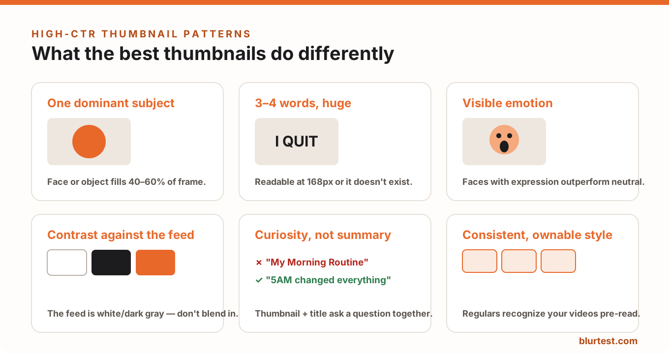
The best thumbnails have exactly one thing to look at: a face, a product, an object mid-transformation. It typically fills 40–60% of the frame. Cluttered scenes die at small sizes — at the 168px suggested-sidebar size, a busy thumbnail reads as noise. This is visual hierarchy at its most extreme: one winner, everything else demoted or deleted.
2. Three or Four Words, Enormous
Thumbnail text isn't a caption — it's a visual element that happens to be readable. High-CTR channels use 3–4 words at a size that fills a quarter of the frame's height, in heavy weights with strong outlines or backing shapes. If the text repeats the title, it's wasted; the best thumbnail text adds a second layer ("I QUIT" on a thumbnail titled "My Last Day at Google").
3. Visible, Slightly Exaggerated Emotion
Faces are attention magnets — human brains process them before anything else in the frame. But neutral faces don't move CTR; expressive ones do. Surprise, joy, disbelief, concern: the emotion is a promise about how the video will make the viewer feel. The exaggeration that feels silly at 1280px reads as exactly right at 168px.
4. Contrast Against the Feed, Not Just Inside the Frame
Your thumbnail never appears alone — it sits in a grid of competitors on a white (or near-black) YouTube interface. The best channels design against that environment: saturated brand colors, dark-on-light or light-on-dark subject separation, and edges that don't dissolve into the page background. Before publishing, screenshot your thumbnail next to five videos it will compete with; if it blends, it loses.
5. Curiosity Gap, Not Summary
A thumbnail that fully explains the video removes the reason to click. The high-CTR pattern is thumbnail and title working as a two-part question: the thumbnail shows an intriguing state ("a car buried in sand"), the title supplies half the context ("We Left It for a Year"), and the click supplies the rest. Show the moment before or after the payoff — never the payoff itself.
6. A Consistent, Ownable Style
Top channels are recognizable in the feed before the viewer reads anything: same face placement, same font, same palette. That's compounding CTR — subscribers click faster on what they recognize, and the algorithm rewards it. Pick a style your niche isn't using and repeat it until it's yours.
7. Designed at Small Size, Checked Under Blur
The discipline behind all six patterns: the best thumbnail makers judge their work at the size and speed it will actually be seen — tiny and in motion. The quick manual version is the blur test: shrink to 168px, blur slightly, and check whether the subject, emotion and text still land. The automated version is BlurTest's thumbnail analysis: a clarity score plus a heatmap of what registers at feed-scroll speed, in 30 seconds.
Stealing These Patterns for Your Niche
- Audit the winners: take the 10 highest-viewed videos in your niche from the last 6 months and note subject count, word count, emotion, and palette. The pattern will be blunt.
- Make three, not one: design three thumbnail options per video and test them before publishing instead of betting the first 48 hours on a guess.
- Swap losers: thumbnails can be changed after publishing without losing stats — an underperforming video with strong retention is usually a thumbnail problem, and a swap is free.
FAQ
Do faces always win in thumbnails?
Faces with real emotion outperform most alternatives, but strong object-based thumbnails (a transformation, a forbidden thing, an absurd scale comparison) win in niches like tech, cooking and engineering. The constant isn't the face — it's one dominant, emotionally-charged subject.
Should thumbnail text repeat the video title?
No. The viewer reads both together; repeating wastes the slot. Use the thumbnail text for the emotional layer and the title for the informational one.
What's a good CTR for YouTube?
YouTube's own guidance puts typical CTR between 2% and 10%, but it varies wildly by surface and audience. Compare a video against your channel's own median, not a global number — and treat thumbnail swaps as the cheapest CTR experiment you can run.
Test your thumbnail at feed-scroll speed
Thumbnails are judged in milliseconds at tiny sizes. See whether yours survives — and what to fix to lift CTR.
Analyze My ThumbnailOr start with a free design roast — no signup needed.