
Instagram Post Layout: Sizes, Zones and Grids That Stop the Scroll
Instagram gives your post a fraction of a second. The layout decides: 4:5 sizing, hook zone on top, one subject in the middle, action at the bottom — plus the grid-crop trap most creators miss.
Instagram gives your post a fraction of a second in a feed engineered for motion. The layout — the sizes you export at, where you place the hook, how the eye moves through the frame — decides whether a thumb stops or slides past. Design quality matters less than most creators think; layout discipline matters more.
This guide covers the exact post sizes for 2026, the three-zone layout that stops the scroll, carousel structure, and the grid-crop trap that quietly ruins profiles.
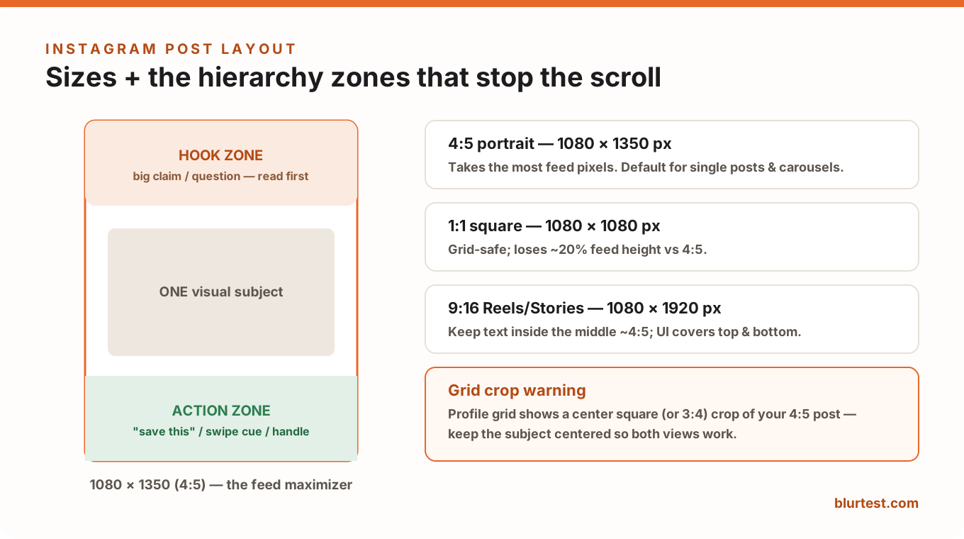
Instagram Post Sizes (2026)
- Portrait 4:5 — 1080 × 1350 px. The default. It occupies the most feed pixels a post can get; a square post surrenders ~20% of that real estate for free.
- Square 1:1 — 1080 × 1080 px. Grid-safe and fine for carousels where consistency matters more than reach.
- Reels / Stories 9:16 — 1080 × 1920 px. Full-screen, but the UI (username, caption, buttons) covers the top and bottom — keep anything important inside the middle 4:5 area.
- Export at 1080px wide minimum, JPG at high quality. Instagram recompresses everything; starting sharp is your only defense.
The Three-Zone Layout That Stops the Scroll
Feed posts are scanned top-to-bottom in a single glance. The layouts that consistently stop thumbs treat the 4:5 frame as three zones:
- Hook zone (top ~25%): the big claim, question or number — the largest text in the frame. This is what peripheral vision catches mid-scroll. If the hook is in the middle or bottom, it's invisible during the scroll.
- Subject zone (middle ~50%): one visual subject. One face, one product, one chart. The same single-dominant-element rule as every other format — see visual hierarchy — but compressed into a phone-width frame.
- Action zone (bottom ~25%): the "save this", the swipe cue, the handle. It's read only after the hook and subject have earned the stop, so it should be visually quietest.
The most common layout failure is democratic design: five text blocks of equal size, no zones, no order. Under a blur test those posts turn to uniform noise — which is exactly how a scrolling thumb experiences them.
Carousel Layout: One Idea Per Slide
- Slide 1 is a thumbnail, not a page. It competes in the feed like a YouTube thumbnail: hook zone + one subject, nothing else. Detail lives on slides 2+.
- One idea per slide, stated in the slide's own hook position — people swipe fast and re-read never.
- Visual continuity: same background, same type system, same accent across slides. The swipe should feel like turning pages of one document.
- End with an action slide: save/share/follow, plus the promise of what following gets them.
The Grid-Crop Trap
Your profile grid shows a center crop of each post — a 4:5 post appears as a square (or 3:4) tile. If your hook text hugs the top edge, the grid version decapitates it, and your profile — the thing potential followers actually browse before following — becomes a wall of half-sentences. Keep the subject centered and let the hook sit just inside the crop line, or design hook text that still works when trimmed.
Type and Color Rules for Feed Survival
- Minimum ~30px text at 1080px width — anything smaller is unreadable on a phone at feed speed.
- Max two type sizes per slide: hook and support. Three-plus sizes reads as clutter.
- One accent color against a calm background; feeds are saturated, so restraint pops. (The counterintuitive contrast rules are in our Instagram visual hierarchy deep-dive.)
- Contrast-check against both feed modes: Instagram is white for some users, near-black for most — borders or backing shapes keep edges defined in both.
Test the Layout Before You Post
The honest check takes 30 seconds: blur the design and see whether the hook and subject still dominate, in the right order. BlurTest's social media analysis automates it — upload the post (or each carousel slide) and get a clarity score plus a heatmap of what a scrolling eye actually catches, before you spend the post's one shot at the feed.
Instagram Layout FAQ
What's the best size for an Instagram post?
1080 × 1350 px (4:5 portrait) for regular feed posts — it takes the maximum feed space. Use 1080 × 1080 only when grid consistency matters more than reach, and 1080 × 1920 for Reels and Stories.
Why do my posts look blurry on Instagram?
Instagram recompresses aggressively. Export at exactly 1080px wide (not larger — downscaling on upload adds another compression pass), high-quality JPG, and avoid fine textures and thin type that compression destroys.
Where should text go on an Instagram post?
The main hook in the top quarter of the frame — it's what peripheral vision catches during the scroll — with supporting text in the middle alongside the subject, and any call-to-action at the bottom. And keep everything inside the center crop so the grid version still works.
Test your social visuals against the scroll
Feeds move fast. See whether your post stops the scroll or slides past unseen — analyzed in 30 seconds.
Analyze My PostOr start with a free design roast — no signup needed.